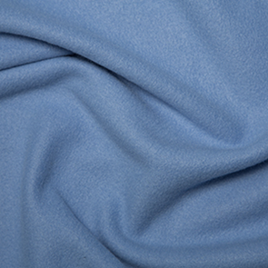
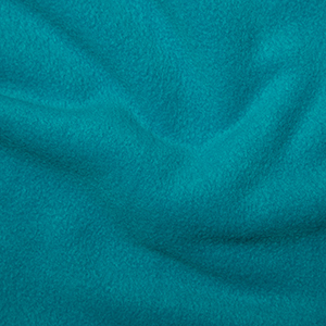
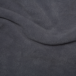
Colour can be very personal but here is a thought on a beanbag and weighted blanket colour. Having a blanket all one colour can have a calming solid feeling about it and since these beanbags and weighted blankets last several years its recommended choosing something you can live with for a long time and in every season , like the furniture in a home
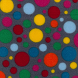
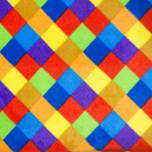
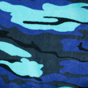
What’s stimulating to one person is not to the next. Looking generally at popular prints whilst they can look very bright and happy initially, over the long haul one might get tired of a particular print or it may appear too stimulating at certain times of the year. Prints appear to have more of a contracting quality if seen too much. It can be soothing to see a print amongst a lot of solid colours.
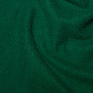
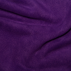
With these products I am attempting to enhance the expansion quality , the’ breathing out’, the ‘letting go’. So I am leaning towards one colour for beanbag and blanket for maximum calm and blending in to my environment., e.g how I feel when in nature and what I see there , forrest green, meditararian turquoise, mid grey sky, Fields of green emerald/forrest, midnight blue / Early dawn, evening sky.
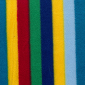
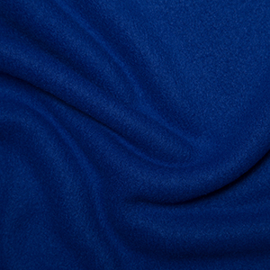
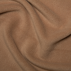
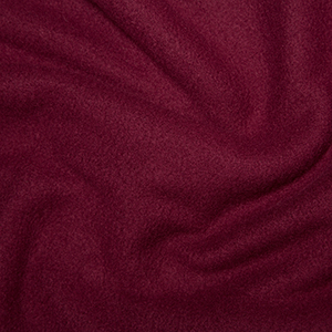
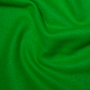
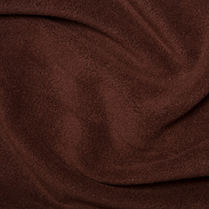
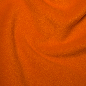
Reds, orange, pinks , wine and tan are on on the warming side. Blues, navy, purple, grey, green, brown tend on the cooling side. Navy is now added to the list even though there isn’t a picture yet.

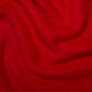
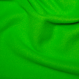
[Looks more vibrant than it looks here]
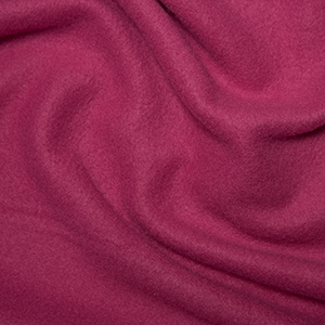
[Looks more vibrant than it looks here]
Plain navy is also available